
Skin tone variations shape how tattoos look during application, healing, and long-term wear, so artists who want consistent results treat skin as part of the design process. Tone, undertone, melanin level, and skin texture can influence contrast, how colors read, and how fine details settle after healing. A design that appears high-contrast to one person may look softer to another, even with the same ink and technique, because the skin itself serves as the background layer. Managing this well is not about limiting options; it is about planning for visibility, balance, and longevity while keeping the client’s goals central. Artists adapt by choosing line weights that hold up, adjusting shading ranges, and selecting color palettes that remain readable over time. They also rely on clear communication, since many clients bring reference images that do not reflect their own skin tone. When the workflow is thoughtful, clients leave with a tattoo that fits their skin naturally and stays legible as it heals and ages.
Designing for real skin
-
Consultation, lighting, and expectation setting
A strong approach begins in consultation, where the artist evaluates how the design will translate on the client’s skin under real lighting. Studio lighting can be bright and flattering, but tattoos are seen in daylight, office lighting, and nighttime settings, so artists consider how contrast will read across environments. They also discuss undertones, because warm or cool undertones can influence how certain pigments appear once healed. During this stage, artists often recommend design adjustments to preserve clarity, such as slightly larger sizes, heavier line weights, or more simplified detail spacing to prevent visual crowding. Reference images are handled carefully. Many social media photos are edited or taken immediately after tattooing, which makes lines and colors look sharper than they will later, creating unrealistic expectations. Clients searching for Tattoos and Piercings near me may quickly compare portfolios. Still, a better indicator of quality is whether an artist can show healed examples across a range of skin tones and explain why a design choice supports longevity. Consultation also covers placement, since friction, sun exposure, and movement affect all skin, but can influence contrast retention differently depending on tone and pigment selection. The goal is to create a clear plan that respects the client’s vision while maintaining readability.
-
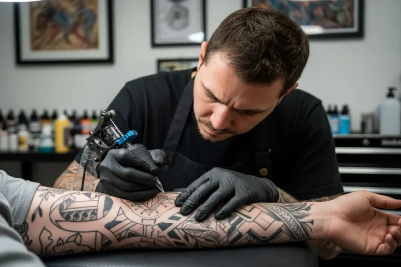
Line weight, contrast planning, and shading strategy
Once the concept is set, artists manage skin tone variations by building a contrast plan into the design. On deeper skin tones, extremely light values and pale inks can disappear after healing, so artists often rely more on strong line structure, deliberate negative space, and shading that stays within a readable range. This does not mean heavy or harsh tattoos; it means the artist chooses a contrast ladder that will still separate shapes once the tattoo settles. For lighter skin tones, very soft gray shading can show easily, but it can also highlight unevenness if the technique is inconsistent, so control still matters. Artists may adjust gradients to keep transitions smooth and avoid patchiness, especially in realism and micro-shading work. Detail spacing is important across all tones because ink naturally spreads slightly over time, and crowded details can blur into one another, reducing clarity. A strong method is to design with bold shapes first, then add texture only where it strengthens the main read. This approach supports long-term legibility without relying on delicate highlights that may fade.
-
Color selection and how pigments heal differently
Color tattoos require even more planning because pigments interact with the skin’s natural tone like a filter layer. Some colors that look bright in the cap or on stencil previews may heal more muted on melanin-rich skin, while other colors remain strong and vibrant when chosen thoughtfully. Artists often prioritize saturated jewel tones, strong midtones, and clean blacks for structure, then use color to support form rather than relying on very light pastel highlights. For lighter skin tones, pastels show up more easily, but they may still fade faster depending on sun exposure and placement, so color longevity remains a key consideration. Artists also consider how different inks settle, since some pigments may heal warmer or cooler than expected. Test swatches are not always practical, but artists can show healed photos of similar palettes and tones to guide their choices. They may also adjust the amount of negative space around color fields so the tattoo stays readable even if some hues soften over time. Color planning is less about forcing a specific look and more about creating a palette that will age gracefully.
Clear tattoos for all
Tattoo artists manage variations in client skin tone by combining thoughtful consultation, contrast planning, and technique control to support clear healing. They adjust line weight, shading ranges, and detail spacing to protect readability over time, and they select color palettes that remain visible without relying on very light values that may fade quickly. During tattooing, consistent depth control and gentle workflow choices reduce overwork and support even saturation, while customized aftercare guidance helps preserve contrast and clarity. When portfolios include healed work across diverse skin tones, and communication stays respectful, clients feel confident and understood. The result is personalized art that looks natural on the client’s skin and remains legible as it ages.